Vietnam1965
Active Member
- Sep 26, 2021
- 359
Hi Guys,
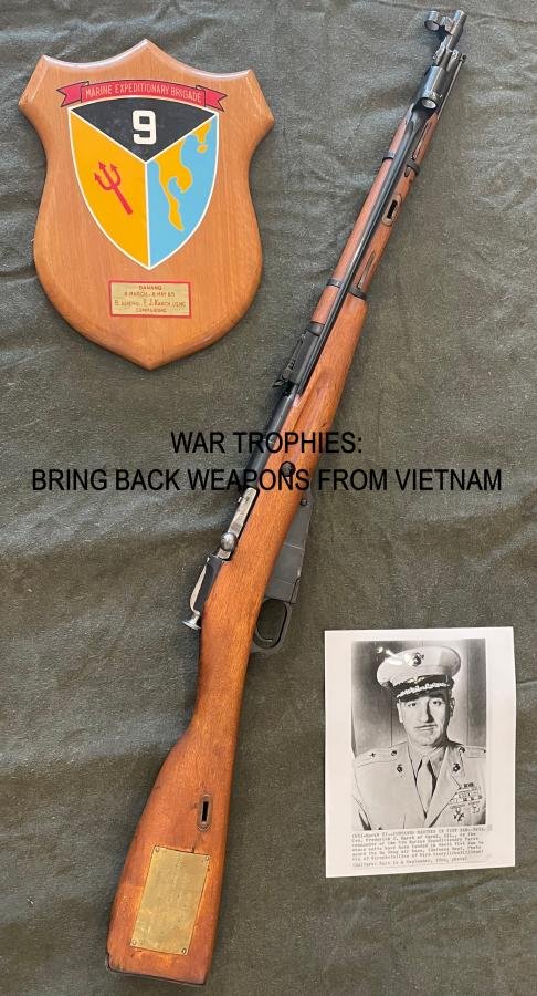
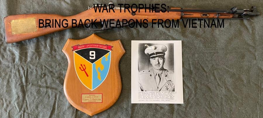
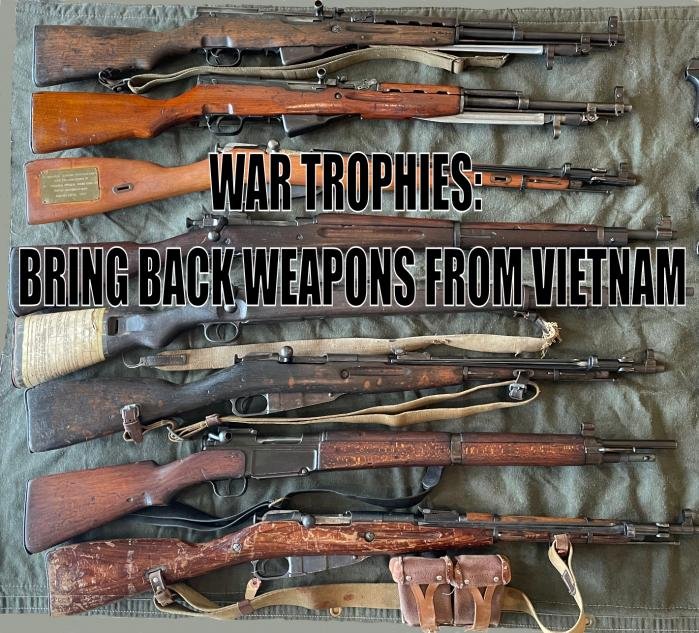
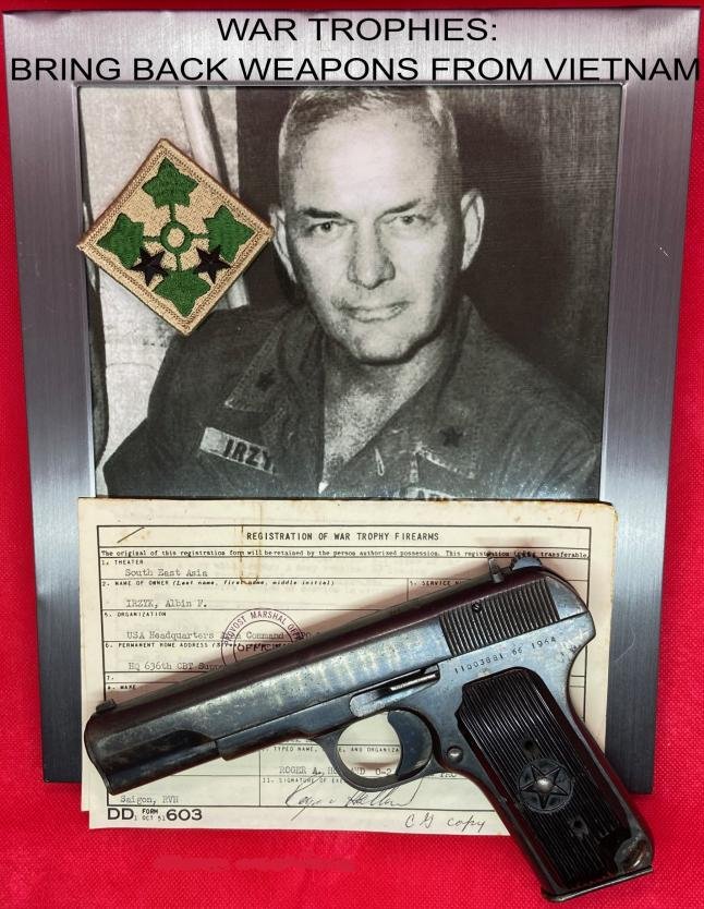
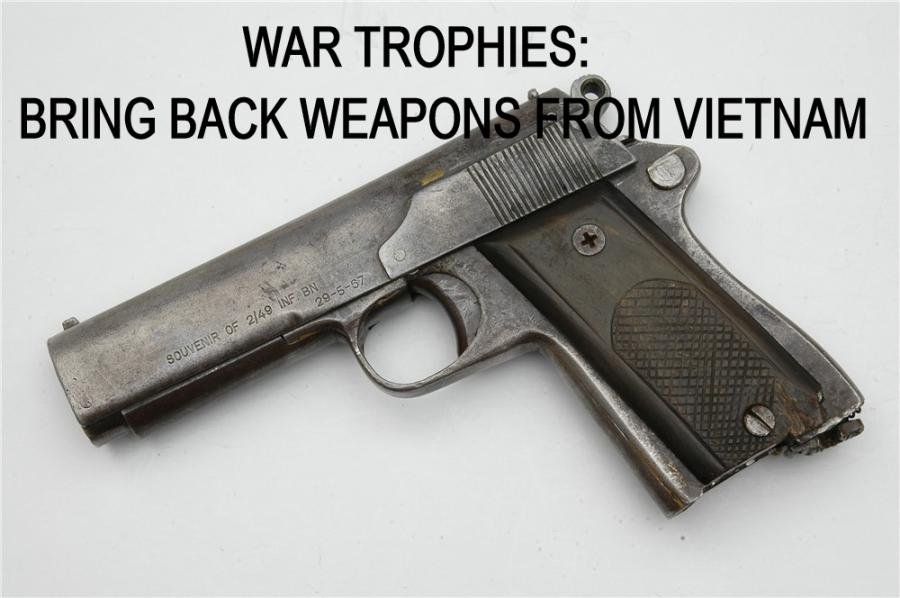
I'm wrapping up my book on Vietnam bring back weapons and have been trying to come up with a cool cover. I would greatly appreciate everyone's opinions on what I have so far. They still need some tweaking. A bring back Luger from an advisor is also in the book so I was thinking of placing it on a Vietnam red beret as another option. Thanks!
I'm wrapping up my book on Vietnam bring back weapons and have been trying to come up with a cool cover. I would greatly appreciate everyone's opinions on what I have so far. They still need some tweaking. A bring back Luger from an advisor is also in the book so I was thinking of placing it on a Vietnam red beret as another option. Thanks!
") (I didn't see aray's before posting mine)
(I didn't see aray's before posting mine)")