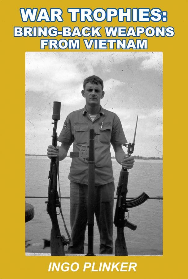
Opinions needed for book cover!

The #1 community for Gun Owners of the Northeast

Member Benefits:

  • No ad networks!
  • Discuss all aspects of firearm ownership
  • Discuss anti-gun legislation
  • Buy, sell, and trade in the classified section
  • Chat with Local gun shops, ranges, trainers & other businesses
  • Discover free outdoor shooting areas
  • View up to date on firearm-related events
  • Share photos & video with other members
  • ...and so much more!
  • Bob A

    όυ φροντισ
    MDS Supporter
    Patriot Picket
    Nov 11, 2009
    30,925
    The busy one with all of the rifles. Makes it more interesting than just a thing or two.
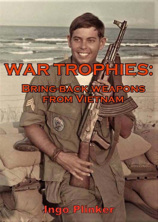
    Yeah, that one looked most like a book cover. Maybe replace one of the rifles with a couple pistols?
     

    AssMan

    Meh...
    MDS Supporter
    Jan 27, 2011
    16,427
    Somewhere on the James River, VA
    The middle one with all the rifles is the most interesting. It's a bit cluttered though. The title looks too busy sitting on top of the rifles though, so maybe move it to the top or make space in the middle.
     
    Jul 1, 2012
    5,733
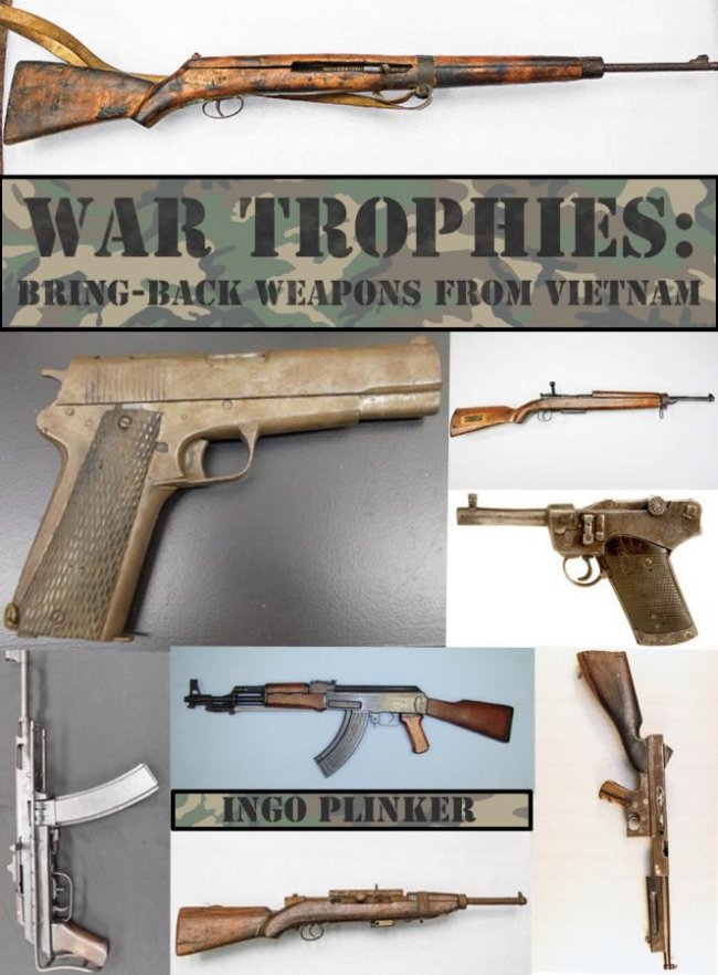
    I also like the one with all the rifles, but no reason you can't include the "field expedient" pistol AND the Luger.

    ^^^ This.
    You want the cover to convey what the book is about, so including a couple of rifles, pistols and bring-back papers (maybe other accessories?) is better than just a grouping rifles filling the page. As a pistol collector, if I saw this in the wild (without any prior MDS knowledge) with just rifles on the cover, I'd probably keep on moving. You've got a broad range of things to show, based on your posts here, so showcase that on the cover if at all possible. And like mentioned earlier, you have the back cover to use as well, either to extend the front or for a separate pic.
     

    ToolAA

    Ultimate Member
    MDS Supporter
    Jun 17, 2016
    10,576
    God's Country
    Hi Guys,

    I'm wrapping up my book on Vietnam bring back weapons and have been trying to come up with a cool cover. I would greatly appreciate everyone's opinions on what I have so far. They still need some tweaking. A bring back Luger from an advisor is also in the book so I was thinking of placing it on a Vietnam red beret as another option. Thanks!

    First off, it's been a real pleasure to read about all of the stories you've shared with us thus far. I had no idea you were working on a book and in some ways I think it's cool that you have included us.

    Now for the book cover, I'm going to go against the grain a bit. I'm also going to be extremely critical not to be a jerk, but because I think you deserve the best criticism I can give, in order to help you make the most successful cover you can. Please do not take it as a personal attack in any way. It's NOT. I also may reiterate things that others have suggested. If so, I mean no discredit to those who have already made such suggestions. I'm just trying to be complete and concise.

    1) None of the titles on any of the examples read well. The fonts are too small and or they are obscured by the images. You need to choose a significantly larger font and something a bit more stylized. The words "War Trophies" probably needs to take up the most space, perhaps 15% of the entire cover space. The text "Bring Back Weapons from Vietnam" Should probably be about the same width as the cover, but the height of that text would be about 1/3 of the War Trophies Text. Take a look at the cover for Chris Kyle's book "American Gun" Count the actual characters in his title and Subtitle, your book has exactly the same number of characters (including spaces) as his book. I think you should shoot for about the same scale of text in your cover. Another good example is this cover "The Guns of Johns Moses Browning". His title and subtitle have even more characters than your book title, those words take up more than 1/3 of the total cover space, but the graphic designer managed to nest those words within the photo image frame very well.

    2) I think your cover art is mostly too busy. The cover art/photos really serve two purposes. The images really need to reinforce the most basic elements of the book content. However, the cover needs to also work like the cover of Playboy Magazine. It has to inspire some imagination which leads the reader to WANT to discover more. These goals are usually best accomplished by displaying a more simplistic image. Here is a cover that I think was done pretty well. Firearms: An Illustrated History What I think makes this cover good is that they just show a very detailed closeup. The person browsing covers looking for the next book to read, fills in the missing parts of this really detailed image, but he also may want to open that cover to discover what he is missing. The simplicity of this image as well as the very high quality and detail of this image is what makes it work so well. Of all the covers you presented, I find the last image with just the pistol has some elements if this concept.

    3) With your content, I don't think you can get away with just a single graphic element in your cover. There is an important human element to your book, and some of that needs to be evident from the cover. I can see that in the one cover with the picture of Albin Irzyk you are trying to tell more of the story, but this is still too literal and too busy. To me this is the type of image I would expect on the back cover. In fact it's almost the perfect back cover. A graphic designer would likely make the firearm image most prominent, but there would be some subtle graphic elements revealing just a little more of the story. Take a look at this cover of Suppliers to the Confederacy The graphic designer uses some faded images to reduce their impact but still show some elements of the deeper story. Perhaps you can use this technique to let the reader know that this is more than a pretty picture book.

    4) There is something about the title that I find lacking. It's a book about firearms and the stories of the men who fought for their country and earned the privilege to bring them back home. I'm really hung up on the words "Bring Back Weapons". I know what it means literally but it just sounds clunky. Just like the cover art, there is some element of the actual title that needs to simultaneously clearly explain the book topic and also create some mystery that causes the potential reader to be curious enough to pick it up from the shelf. What I find most interesting in your posts about these pieces of history is the actual stories surrounding the actual weapons and their passage from enemy combatants to become pieces of very personal American military history. The fact that they were "Brought Back" seems obvious, like it doesn't need to be said. Is the most striking feature of these firearms the fact that they were "Bring Back's" I don't think so. The most striking an interesting part of the story is HOW they arrived here. I wish I had a better title to suggest at this time, but I don't. I would just encourage you to ponder this a bit more.


    My daughter used to work in the marketing department for the Publisher Simon & Schuster. She's seen thousands of book covers and I'm sure I could send some of your ideas to her for some better feedback.

    I'm really hoping for a book cover that worthy of the excellent content within. Keep the ideas coming.
     

    budman93

    Ultimate Member
    Mar 1, 2013
    5,277
    Frederick County
    I would recommend putting the title on top of a solid colored strip for contrast against the photo. The title doesn't stand out very well when it's just text with a picture right behind it.
     

    Vietnam1965

    Active Member
    Sep 26, 2021
    359
    First off, it's been a real pleasure to read about all of the stories you've shared with us thus far. I had no idea you were working on a book and in some ways I think it's cool that you have included us.

    Now for the book cover, I'm going to go against the grain a bit. I'm also going to be extremely critical not to be a jerk, but because I think you deserve the best criticism I can give, in order to help you make the most successful cover you can. Please do not take it as a personal attack in any way. It's NOT. I also may reiterate things that others have suggested. If so, I mean no discredit to those who have already made such suggestions. I'm just trying to be complete and concise.

    1) None of the titles on any of the examples read well. The fonts are too small and or they are obscured by the images. You need to choose a significantly larger font and something a bit more stylized. The words "War Trophies" probably needs to take up the most space, perhaps 15% of the entire cover space. The text "Bring Back Weapons from Vietnam" Should probably be about the same width as the cover, but the height of that text would be about 1/3 of the War Trophies Text. Take a look at the cover for Chris Kyle's book "American Gun" Count the actual characters in his title and Subtitle, your book has exactly the same number of characters (including spaces) as his book. I think you should shoot for about the same scale of text in your cover. Another good example is this cover "The Guns of Johns Moses Browning". His title and subtitle have even more characters than your book title, those words take up more than 1/3 of the total cover space, but the graphic designer managed to nest those words within the photo image frame very well.

    2) I think your cover art is mostly too busy. The cover art/photos really serve two purposes. The images really need to reinforce the most basic elements of the book content. However, the cover needs to also work like the cover of Playboy Magazine. It has to inspire some imagination which leads the reader to WANT to discover more. These goals are usually best accomplished by displaying a more simplistic image. Here is a cover that I think was done pretty well. Firearms: An Illustrated History What I think makes this cover good is that they just show a very detailed closeup. The person browsing covers looking for the next book to read, fills in the missing parts of this really detailed image, but he also may want to open that cover to discover what he is missing. The simplicity of this image as well as the very high quality and detail of this image is what makes it work so well. Of all the covers you presented, I find the last image with just the pistol has some elements if this concept.

    3) With your content, I don't think you can get away with just a single graphic element in your cover. There is an important human element to your book, and some of that needs to be evident from the cover. I can see that in the one cover with the picture of Albin Irzyk you are trying to tell more of the story, but this is still too literal and too busy. To me this is the type of image I would expect on the back cover. In fact it's almost the perfect back cover. A graphic designer would likely make the firearm image most prominent, but there would be some subtle graphic elements revealing just a little more of the story. Take a look at this cover of Suppliers to the Confederacy The graphic designer uses some faded images to reduce their impact but still show some elements of the deeper story. Perhaps you can use this technique to let the reader know that this is more than a pretty picture book.

    4) There is something about the title that I find lacking. It's a book about firearms and the stories of the men who fought for their country and earned the privilege to bring them back home. I'm really hung up on the words "Bring Back Weapons". I know what it means literally but it just sounds clunky. Just like the cover art, there is some element of the actual title that needs to simultaneously clearly explain the book topic and also create some mystery that causes the potential reader to be curious enough to pick it up from the shelf. What I find most interesting in your posts about these pieces of history is the actual stories surrounding the actual weapons and their passage from enemy combatants to become pieces of very personal American military history. The fact that they were "Brought Back" seems obvious, like it doesn't need to be said. Is the most striking feature of these firearms the fact that they were "Bring Back's" I don't think so. The most striking an interesting part of the story is HOW they arrived here. I wish I had a better title to suggest at this time, but I don't. I would just encourage you to ponder this a bit more.


    My daughter used to work in the marketing department for the Publisher Simon & Schuster. She's seen thousands of book covers and I'm sure I could send some of your ideas to her for some better feedback.

    I'm really hoping for a book cover that worthy of the excellent content within. Keep the ideas coming.

    Wow great critique of my book covers thanks. This is why I posted here and other forums for honest opinions! I've had so many great ideas posted its starting to get confusing! Someone suggested a professional to help and they have been contacted. I've always been interested in military history and thought it would of interest to some about this subject. I can only think of one other author who has written about bring backs and that is Ed Tinker who did a series. I'm not a professional writer but have written a few books mainly fire service non-fiction as I was a firefighter for 36 years. When I began this project, I was just going to have maybe 25 or so books printed for fellow collectors and family/friends but there seems to be a great interest in this subject. This book will be non-profit and all proceeds after printing costs will be donated to the Disabled American Veterans or Wounded Warriors Project. Thanks again for all your great suggestions! I really appreciate it!
     

    Biggfoot44

    Ultimate Member
    Aug 2, 2009
    33,173
    As gun guys & gals , in person we would snatch up an 8x10 of the base image from #3 , and pour over the details . But that's Not what makes a good Book Cover

    A book cover needs to catch the eye from two aisles away , and from 6 feet away convey the theme of the book .

    As - Is , none of them.

    Buy Mule is on the right track . The image from #1 has good potential . Uncluttered , and hits the high points : Vietnam , recognizable commie rifle , and U.S. Servicemen .

    The text needs to be tweaked . Different font size for main and subtitles , stand out better , and placement . Exactly how ? I dunno , I'm not a graphic designer . But a pro would . Instead of the photo taking up the whole cover , have a border around it , with Title and Subtitle above in border , and author below maybe ?

    The picture from # 4 would be good on back cover , taking part of cover , with synopsis of book , author CV , blurbs , whatever below .
     

    Vietnam1965

    Active Member
    Sep 26, 2021
    359
    Some nice guy on another forum put together these sample covers for me! I really like the first two. The idea of a random GI holding a captured weapon for the cover is another great idea!
     

    Attachments

    • wt cover1.jpg
      wt cover1.jpg
      63.3 KB · Views: 116
    • wt cover2.jpg
      wt cover2.jpg
      65.7 KB · Views: 106
    • wt cover3.jpg
      wt cover3.jpg
      74.9 KB · Views: 116

    ohen cepel

    Ultimate Member
    Feb 2, 2011
    4,515
    Where they send me.
    Will you need permission from the "random vet" in the pic? Could come back to be an issue if he is horribly antigun now and thinks you're profiting from him. Or, his estate thinks that.

    Unlikely, I know, but a consideration.
     

    Vietnam1965

    Active Member
    Sep 26, 2021
    359
    Will you need permission from the "random vet" in the pic? Could come back to be an issue if he is horribly antigun now and thinks you're profiting from him. Or, his estate thinks that.

    Unlikely, I know, but a consideration.

    Good point I never thought of that! Thanks!
     

    ToolAA

    Ultimate Member
    MDS Supporter
    Jun 17, 2016
    10,576
    God's Country
    Thanks again for all your great suggestions! I really appreciate it!

    So I was thinking about the title more and I was wondering if something like this may sound more enticing.

    War Trophies​

    Weapons of the Viet Cong
    and the stories of American Soldiers
    who Brought them home​


    I realize it's longer, but like some of the examples I posted last night, but I think it's important to give some hint that the content includes the soldiers stories.
     

    Jim12

    Let Freedom Ring
    MDS Supporter
    Jan 30, 2013
    34,058
    HOW MANY War Trophies are in the book?

    I would add the number to the title.

    Like some others, I like the pic with the rifles, but would add some pistols to it to broaden the attraction.

    You've been a real asset to this forum. Thanks!
     

    Users who are viewing this thread

    Latest posts

    Forum statistics

    Threads
    275,434
    Messages
    7,281,598
    Members
    33,455
    Latest member
    Easydoesit

    Latest threads

    Top Bottom