that is great just got back from painting the shop and could not wait to see if any one posted....the first on is great...just a curous question can the states be outlined and maybe a couple color choices
that is great just got back from painting the shop and could not wait to see if any one posted....the first on is great...just a curous question can the states be outlined and maybe a couple color choices
Absolutely. The state can be any color you want. Any item can be changed, from individual lines to entire words. Whatever you want to see, just let me know. I'll get some more together in the mean time.
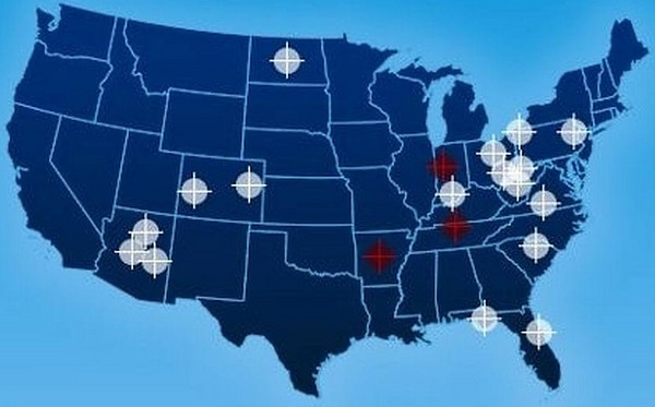
just had a brain storm....which doesnt happen to often. since the crosshairs are right in line with were delaware outline would be can we shrink the penusla a bit so that delaware outline would be lined up with the crosshairs. then finish the outline of delaware to fill in the gaps...make any sence....oh and thanks for helping me out
Ah, outline the states, I misunderstood that before. Let me have a try at it.
ETA: Honestly, I can't get the state lines in and have it look even remotely good. The lines mess up the whole balance to the picture, and the lines make everything look off.
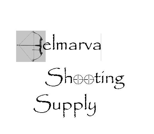
wilcam i like how you used the bow for the D...but my main focus will be guns i may sell a few bows and light supplies but 90% guns and ammo. i like the double crosshairs as well......
Nate how about a very thin grey line outlineing delaware forget about trying to line up the crosshairs
just had a brain storm....which doesnt happen to often. since the crosshairs are right in line with were delaware outline would be can we shrink the penusla a bit so that delaware outline would be lined up with the crosshairs. then finish the outline of delaware to fill in the gaps...make any sence....oh and thanks for helping me out
The dots and tapered lines make it really busy in the middle, and takes away from where you want the person to focus (on the words). Same with the DE line IMO. It adds nothing of value with those things, but detracts a lot from the overall look and feel.
The dots and tapered lines make it really busy in the middle, and takes away from where you want the person to focus (on the words). Same with the DE line IMO. It adds nothing of value with those things, but detracts a lot from the overall look and feel.
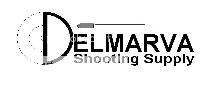
Logos look great. As a sign guy for many years Shooting Supply should be
larger. Nice if logo worked for business cards, hats and signs.going down the
road if I see Shooting Supply I'm stopping.
Logos look great. As a sign guy for many years Shooting Supply should be
larger. Nice if logo worked for business cards, hats and signs.going down the
road if I see Shooting Supply I'm stopping.